I used to think internal software had more room to be rough. If the users worked in the same company, someone could always explain how it worked. Building an IT service desk during my on-site internship at Sortr made me question that assumption.
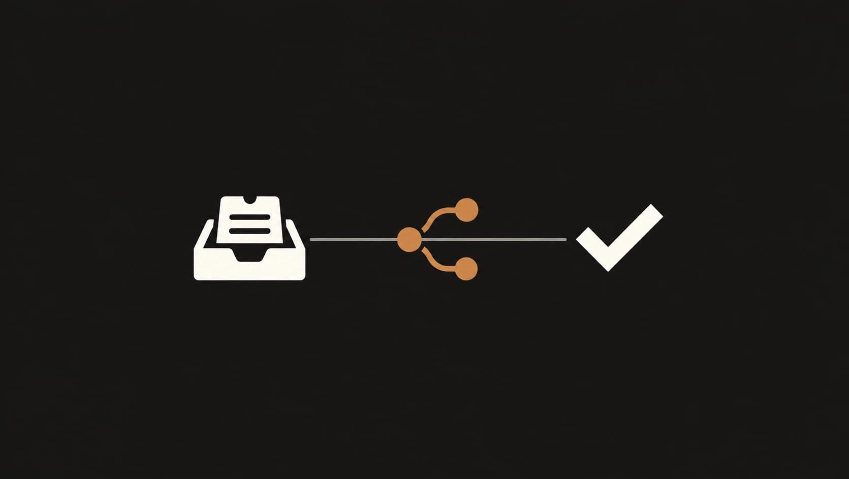
From June through September 2026, I worked as a Full-Stack Web Developer Intern at Sort Outsourcing Solutions Inc. One part of the work was an internal ticketing system for employees to report hardware and software issues. It was intended for more than 50 people within the company domain, with ticket routing and status tracking forming a structured path from submission to resolution.
The interesting design question was not how many technologies the system used. It was whether an employee could describe a problem and understand what happened next without needing a developer nearby.
An internal user is still a user
“Internal” describes who uses a tool, not how much clarity it needs. Employees bring their own context, priorities, and time constraints. They may understand the company but not the system’s assumptions. A workflow that only makes sense after someone explains its categories or status labels is still asking too much of its users.
An IT service desk has two sides to that interaction. The person reporting an issue needs to provide enough useful information. The IT team needs to understand what came in and where it sits in the support process. A form can store a message successfully and still leave both sides uncertain about what the submission means.
Thinking about the workflow this way changed what “working” meant to me. The system was not just a route from a button to a database. It had to make the handoff between an employee and the people handling the request easier to follow.
A submitted form is not a finished workflow
A form that writes a row to a database proves that one part of the flow works. It does not answer whether the categories help people describe their problem, whether the confirmation makes clear that the report was received, or whether the status communicates what is happening after submission.
Those questions do not require an elaborate feature set. They require decisions about the shape of the interaction. A category should help sort a request rather than force an employee to guess at internal terminology. A status should describe a state people can understand. A confirmation should tell the person what happened and, when appropriate, what to expect next.
The same clarity matters on the IT side. Useful reporting depends on the information captured at the start and how it is organized as work moves through the process. A system can centralize issue reports and support routing, but the interface still has to help people provide information in a form that can be acted on.
The ticket form is one point in a longer interaction. Submission, routing, status, and resolution belong to the same experience, even when different people handle each step.
The best interface removes questions
An internal tool should reduce avoidable uncertainty. After submitting a request, an employee should not have to wonder whether it went through. While it is being handled, the status should make the current state legible. The person reporting the issue should know what information is useful, and the IT team should be able to see what needs attention.
When reviewing a design, I find it useful to ask where someone might hesitate and what information they need to continue without a walkthrough.
That perspective also connected with my other work at Sortr. I worked on production WordPress pages, responsive layouts, technical SEO, image delivery, and frontend performance. Those tasks were different from the service desk, but they reinforced that an interface has to work in the conditions where people encounter it. Responsive behavior, content structure, and clear feedback are not decoration added after the “real” engineering. They shape whether the software is usable.
What I took from it
Internal software includes dashboards, admin panels, content systems, and operations tools. Their audience may be smaller than a public website’s, but the people using them still need to understand what the system is doing. Familiarity with the organization does not automatically create familiarity with the interface.
I now think of internal software as product design with a particular audience. The goal is not to make every action self-explanatory through extra text, or to build a tutorial into every screen. It is to make the structure and feedback clear enough that people can do their work without relying on someone to translate the interface.
A good internal tool does not need to impress its users. It needs to make the next step obvious.